
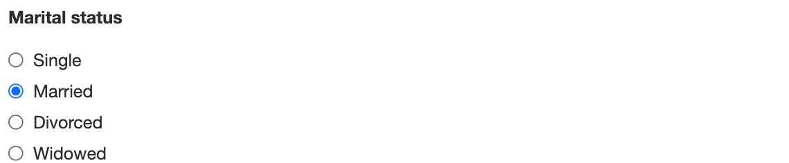
The Radio component shows a short list of options as round buttons. Users can choose only one. Use it when there are a few options and you want them all visible, such as Marital Status or Yes / No / Not Applicable.
For a longer list, use Select. To allow several choices, use Select Boxes.
Set up the options
-
On the Display tab, under Values, add a row for each option.
-
For each row, enter a Label, which users see, and a Value, which is saved.
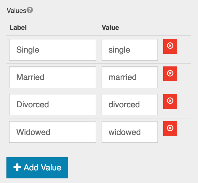
The value, not the label, is what's stored in the submission, compared in conditions and scripts, and mapped to PDFs and GlobalCapture. Choose short values that won't change, such as married for the label Married.
Settings specific to Radio
|
Setting |
Tab |
What it does |
|---|---|---|
|
Values |
Display |
The options, as label and value pairs |
|
Options Label Position |
Display |
Where each option's label sits relative to its button |
|
Inline Layout |
Display |
Shows the options side by side instead of one per line |
|
Wrap inside field set |
Display |
Draws a border around the group of options |
|
Default Value |
Data |
The option selected when the form opens. Enter the option's value, not its label. |
For all other settings, see Common Component Settings.