
The form builder includes shortcuts that help you find components with custom logic, jump straight to that logic, and save your work quickly.
These tools require GlobalForms version 10.13 or greater.
Custom logic indicators
Components that contain custom code show a small icon in their top-right corner, so you can see at a glance where a form has logic. When you hover over the component, the same icon appears as a button in the component's toolbar. Select it to open the component's settings at exactly that code.

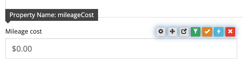
|
Icon |
Shown when the component has |
Selecting the button opens |
|---|---|---|
|
Custom JavaScript (lightning bolt, blue) |
A custom default value or a calculated value |
The Data tab, with the JavaScript expanded. If both are present, Custom Default Value opens first. |
|
Custom Validation (check mark, orange) |
Custom validation code |
The Validation tab, with Custom Validation expanded |
|
Advanced Conditional (filter, green) |
Advanced conditional code for visibility, disabled, required or hidden-input behavior |
The Conditional tab, with Advanced expanded. If several apply, the first in that order opens. |
-
A component can show more than one icon. They are placed side by side.
-
When a container such as a Panel has an advanced condition, only the container shows the icon, not each component inside it.
-
Icons are not shown on components whose settings are locked.
-
Not every script has an icon. Button Custom actions, and custom validation on components inside a Data Grid, show no icon, so check those components' settings directly.
-
After the settings open, you can expand or collapse sections as usual.
Saving your work
|
Where you are |
Action |
Result |
|---|---|---|
|
Form builder |
Ctrl+S (Cmd+S on Mac) |
Saves the form. |
|
Component settings |
Save |
Saves the component and closes its settings. The form is not saved yet. |
|
Component settings |
Save Component & Form, or Ctrl+S |
Saves the component and the whole form. A message confirms the save. |
On a new form that has not been saved yet, Save Component & Form creates the form and keeps you in the builder. After that, the main button changes from Create Form to Save Form.
While you work in the form builder, Ctrl+S saves your form instead of opening the browser's Save Page dialog.
Ordering form actions
Form actions run in the order shown on the form's Form Actions tab. To change the order:
-
Hover over an action until the pointer changes to a grab cursor.
-
Drag the action to its new position. A blue line shows where it will go.
-
Release the mouse. The new order is saved automatically.
Order matters when one action depends on another. For example, a PDF Snapshot action must run before a GlobalCapture Workflow action that attaches the PDF.