
Components are the building blocks of forms and resources: text boxes, lists, buttons, signatures, file uploads and layout tools. This section describes each component in the form builder and when to use it.
Working with components in the form builder
The components are listed on the left side of the form builder, in groups. Drag a component onto the form to add it. When you hover over a component on the form, a toolbar appears:
|
Icon |
What it does |
|---|---|
|
Gear |
Opens the component's settings |
|
Four-way arrow |
Drag to move the component |
|
Copy |
Makes a copy of the component |
|
Red X |
Removes the component. Removing a layout component also removes everything inside it, so check before you confirm. |
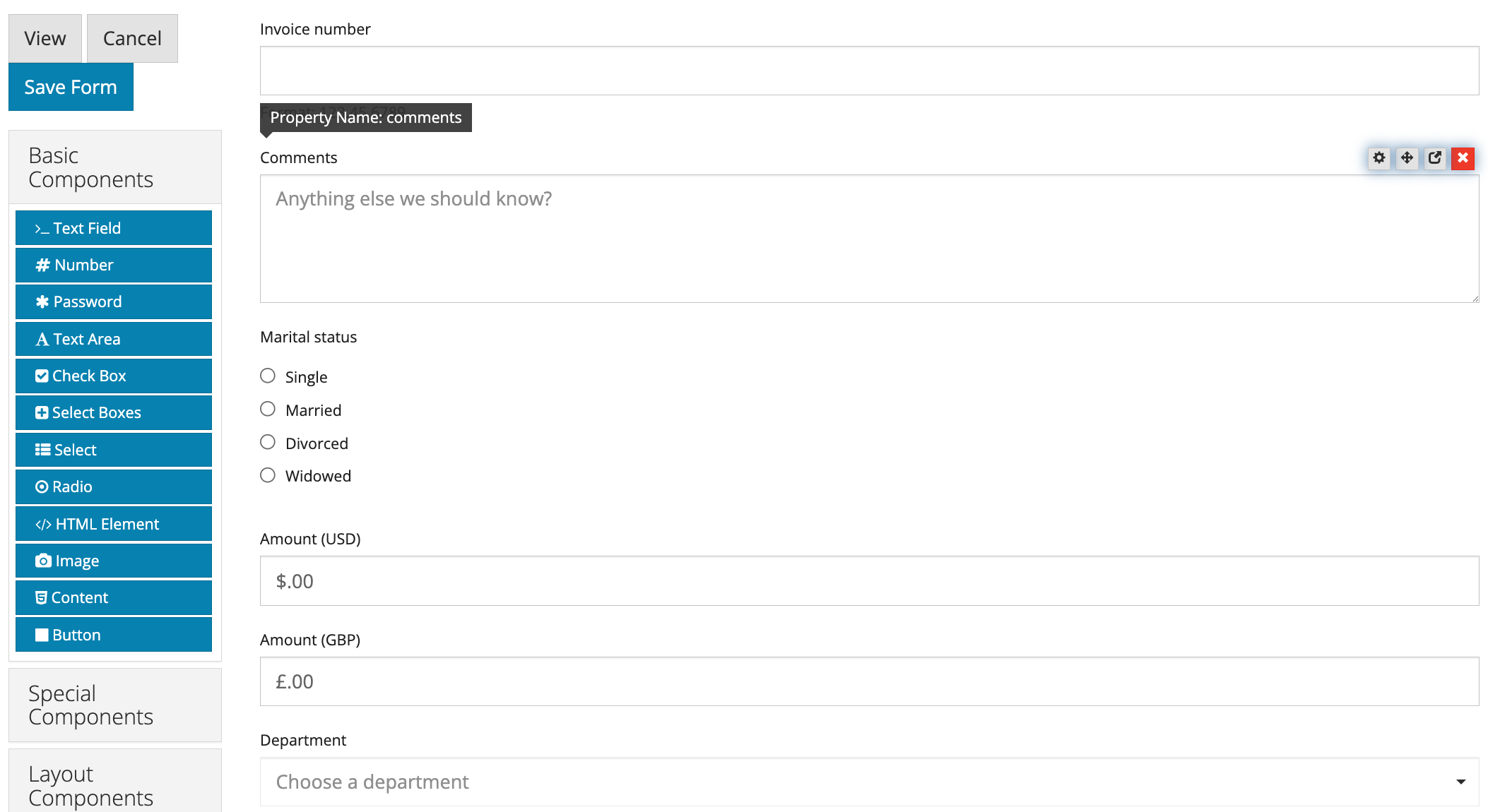
Components that contain scripts or advanced conditions also show colored icons. See Form Builder Tools.
Component groups
|
Group |
Contains |
|---|---|
|
Text Field, Number, Password, Text Area, Check Box, Select Boxes, Select, Radio, HTML Element, Image, Content, Button |
|
|
Typed Signature, Email, Phone Number, Address, Date / Time, Day, Time, Currency, Hidden, Resource, File, Form, Signature, Custom, Container, Data Grid, Edit Grid, Survey |
|
|
Columns, Field Set, Panel, Table, Well |
|
|
Existing Resource Fields |
Components already used in your resources, so you can reuse them on a form |
Settings shared by most components, such as Label, Required, Hidden and Property Name, are explained once in Common Component Settings.
Choosing the right component
-
Use the most specific component for the data: Email for email addresses, Number or Currency for amounts, Date / Time for dates. They check the entry and store it in a consistent format.
-
For a choice from a list, use Radio for a few options, Select for many, and Select Boxes when several can be chosen.
-
For repeating rows, use Data Grid (short rows) or Edit Grid (long rows).