
Show a component only when it is needed, based on what the user has entered elsewhere on the form. For example, show a Spouse's Name field only when Marital Status is Married.
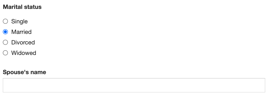
Conditions are set on the component you want to show or hide, on its Conditional tab.
Simple conditions
A simple condition compares one other component's value to a value you enter. No code is needed.
-
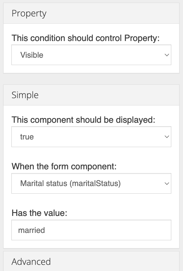
Open the settings of the component to show or hide, and select the Conditional tab.
-
Set Property to Visible.
-
Under Simple, set:
-
This component should be displayed: true
-
When the form component: the component to check, for example Marital Status (maritalStatus)
-
Has the value: the value to match, for example
married
-
-
Save the component.
Enter the value exactly as the component stores it, which isn't always its label:
|
Component checked |
Value to enter |
|---|---|
|
Radio, Select |
The option's value, not its label, for example |
|
Checkbox |
|
|
Select Boxes |
The value of the box that must be checked |
|
Select with multiple values |
Any one of the values. The condition matches if that value is among those selected. |
|
Text Field, Number |
The exact text or number. Upper and lower case must match. |
Show or hide a group of components
To show or hide several components together, place them in a layout component such as a Panel, Columns or Field Set, and set the condition on that container. Everything inside it is shown or hidden with it.
What happens to hidden values
By default, when a component is hidden its value is removed, so data the user entered before changing their mind isn't submitted. To keep the value of a hidden component, turn off Clear Value When Hidden in the component's settings.
A Panel can also clear all the components inside it when it is hidden. See Panel.
Advanced conditions
Use an advanced condition when the decision depends on more than one value, or on anything a simple condition can't compare. An advanced condition is JavaScript that sets the show variable to true or false.
Example: show a Columns component holding the spouse's details only when Marital Status is Married and Include Spouse On Policy is checked.
-
Open the settings of the Columns component and select the Conditional tab.
-
Set Property to Visible and expand Advanced.
-
Enter:
JavaScriptshow = (data.maritalStatus === 'married' && data.includeSpouse === true); -
Save the component.
The script can use these variables:
|
Variable |
Contains |
|---|---|
|
|
The values of every component on the form, by property name, for example |
|
|
Inside a Data Grid or Edit Grid, the values of the current row |
|
|
The settings of the component being evaluated |
|
|
The Moment.js date library |
If a component has both a simple and an advanced condition, the advanced condition is used. If the script doesn't set show, or has an error, the component is shown.
Tips
-
Find a component's property name on its API tab. Property names are case-sensitive.
-
Components with an advanced condition show a green filter icon in the form builder. See Form Builder Tools.
-
The same Property list also makes a component required, disabled or masked. See Making Components Required or Disabled.