
Besides showing and hiding, a component's Conditional tab can make it required, disabled, or masked depending on other values on the form.
Choose the property
On the Conditional tab, the This condition should control Property list selects what the condition controls. Each property has its own simple and advanced condition, so one component can have several.
|
Property |
When the condition is true |
Variable to set in an advanced condition |
|---|---|---|
|
Visible |
The component is shown. See Show or Hide Components. |
|
|
Disabled |
The component can't be edited |
|
|
Required |
The component must be filled in before the form can be submitted |
|
|
Hide Input |
What the user types is masked, like a password |
|
Example: require a description only when asked
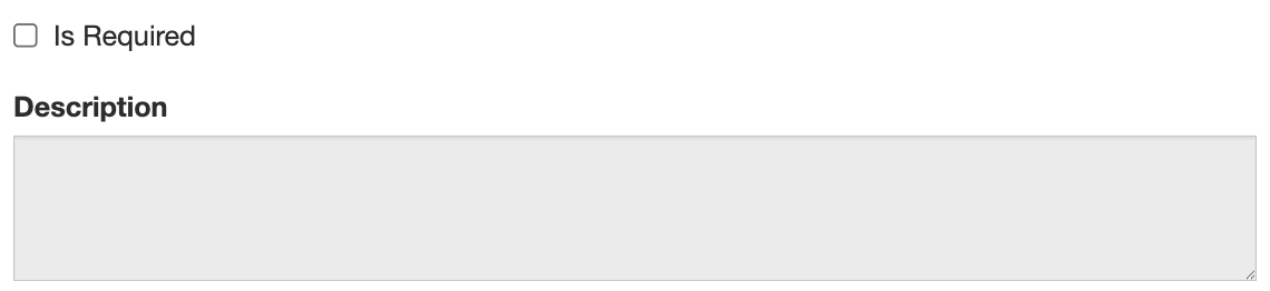
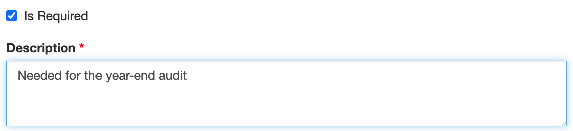
A form has a check box Is Required (isRequired) and a text area Description (description). Description must be filled in when the box is checked, and can't be edited when it isn't.
Make Description required with a simple condition
-
Open the settings of Description and select the Conditional tab.
-
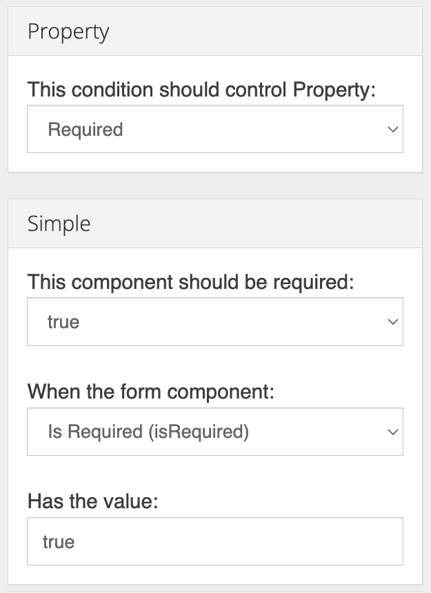
Set This condition should control Property to Required.
-
Under Simple, set This component should be required to true, When the form component to Is Required (isRequired), and Has the value to
true.
Disable Description with an advanced condition
A simple Disabled condition (when Is Required has the value false) would also work. This example uses an advanced condition so it can clear any text left in the field as well:
-
Still on the Conditional tab, set the property to Disabled.
-
Expand Advanced and enter:
JavaScriptdisabled = !data.isRequired; // Clear any text left over from when the box was checked. if (disabled) { data.description = ''; } -
Save the component.
Now Description starts disabled, becomes editable and required when Is Required is checked, and is cleared when the box is unchecked again.
Advanced condition variables
Advanced conditions for every property can use data, row (inside a Data Grid or Edit Grid), component and moment. See Show or Hide Components for details.
If an advanced condition script has an error, its property is treated as true. A broken Required script makes the component required, and a broken Disabled script disables it. If a component is unexpectedly locked or required, check the browser console (F12) for script errors.
Things to know
-
Prefer simple conditions when they work. They're easier for others to read and maintain.
-
A component's settings can also make it always required (Validation tab) or always disabled (Display tab). Use a condition only when it depends on other values.
-
Conditional Required is checked in the user's browser only. A component that is always required is also checked by the server when the form is submitted. If a value must always be present, for example for an integration, make it always required or check it in a custom validation, which also runs on the server.