
The Text Field is a single-line text box, the most common input on a form. Use it for names, reference numbers, short answers and any text that fits on one line.
Prefer a specialized component when one fits: Email and Phone Number check the format, Number and Currency store numbers, Date / Time and Day validate dates, and Text Area allows several lines.
Settings specific to Text Field
|
Setting |
Tab |
What it does |
|---|---|---|
|
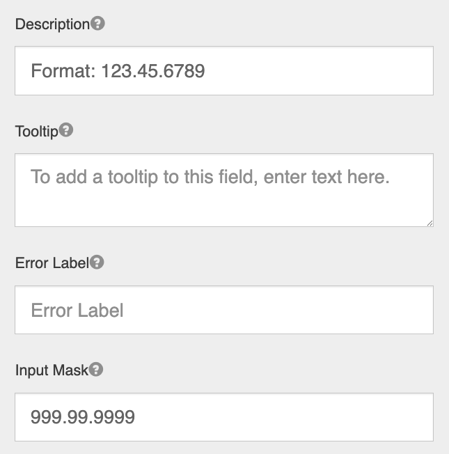
Input Mask |
Display |
A pattern the entry must match. |
|
Current User, Current Node, Current Date |
Data |
Fills the field automatically with the signed-in user's name, the GlobalCapture validation step, or today's date. The value updates each time the form is opened. See Common Script Snippets and Working With Dates for when a script is the better choice. |
|
Minimum Length, Maximum Length, Regular Expression Pattern |
Validation |
Restrict what can be entered |

For all other settings, see Common Component Settings.