
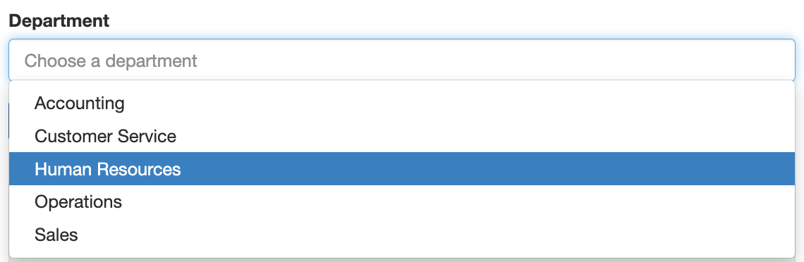
The Select component shows a drop-down list. Use it for lists such as departments, states or general ledger accounts. The list can be typed in, loaded from a web address, or built from data already in the form.
Labels and values
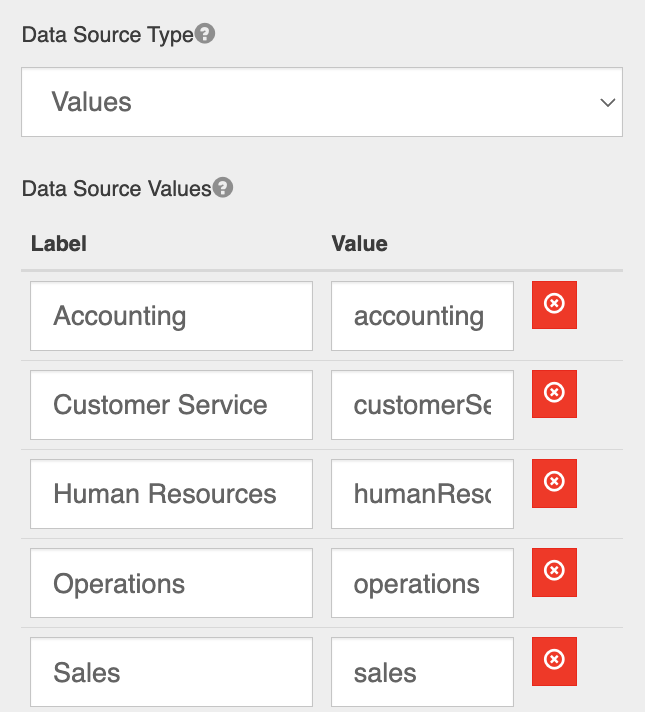
Each option has a Label, which users see, and a Value, which is stored in the submission, used in rules and sent to GlobalCapture.
Data source types
Choose the Data Source Type on the component's Data tab:
|
Type |
Use it when |
|---|---|
|
Values |
You want to type the options in yourself. |
|
Raw JSON |
You want to paste a list of options as JSON. |
|
URL |
The options come from a web address that returns JSON, such as an SQL lookup or another API. Use Data Path if the list is inside the response, and Value Property to choose which property is saved. |
|
Stored Data |
The options come from data already loaded in the form, optionally filtered by another answer. See below. |
|
Resource |
The options come from submissions of a GlobalForms resource. See Resources in Select Components. |
|
Custom |
A script builds the list. See Rules and Scripting. |
Reuse loaded data with Stored Data
Stored Data lets several lists share one set of data without loading it again, and makes dependent lists, such as choosing an office and then an employee in that office, easy to build.
Example: employees in the chosen office
An Employees resource has the fields name and office. The form has a Select Office (office) with the values east and west.
-
Add a Select All Employees with Data Source Type URL and Data Source URL
/employees/submission(the resource's path followed by/submission). Set Store URL Data As toemployees. If users don't need this list, mark it Hidden. -
Add a Select Employee with Data Source Type Stored Data, Stored Data
employees, and Item Template<span>{{ item.data.name }}</span>. -
Set its Stored Data Condition to
item.data.office === data.office, and set Refresh On to Office.
Choosing East now lists only the employees in the east office.
The condition is a JavaScript expression checked for each item; items for which it's true are listed. It can use item (the item being checked, also available under the stored data name), data (the form's answers), row (the current Data Grid row) and value (the value that would be saved). Match the item's shape: resource submissions keep their fields under item.data. If the condition has an error, every item is listed.
The stored list is kept in the form's data under the name you chose, so it is saved with each submission. Keep stored lists small.
Display options
|
Setting (Display tab) |
Description |
|---|---|
|
Remove duplicate options |
Shows each option only once, even if the source data contains repeats. |
|
Option Order |
Shows options in source order (the default), or sorted ascending or descending by their label. |
Keep lists a usable size
Avoid lists with thousands of options. Keep lists under 500 items where possible, and never more than 1,000. Narrow them instead, for example with Stored Data conditions or by filtering on another answer. For large data sources, see Advanced Options On Data Bound Lists.
Related pages
-
Security Headers (when a URL source is on another site)