
Columns place components side by side. Forms are laid out on a grid 12 units wide: a new form is one full-width column, and a Columns component divides a row into narrower columns. On screens less than 768 pixels wide, such as phones, columns stack vertically, so the form still fits.

Add columns
-
Drag a Columns component onto the form. It starts with two columns, each 6 units wide.
-
Drag components into each column.
-
To change the columns, open the settings and edit Column Properties on the Display tab.
Column properties
|
Property |
What it does |
|---|---|
|
Width |
How many of the 12 units the column spans |
|
Offset |
Empty units to the left of the column |
|
Push, Pull |
Move the column right (Push) or left (Pull) by this many units, without changing its place in the form. The Tab key still follows the form order. |
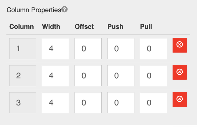
Widths plus offsets in one Columns component should add up to 12 or less. For example:
|
Layout |
Columns |
|---|---|
|
Three equal columns |
Width 4, 4, 4 |
|
Wide and narrow |
Width 8, 4 |
|
One column on the right |
Width 4, Offset 8 |
Columns can be nested, and each nested component is limited to the width of its column.
Tab order
The Tab key moves through all components in the first column before moving to the next column. If your form reads in rows, for example First Name and Last Name on one row and Spouse First Name and Spouse Last Name below, use a separate Columns component for each row. Then Tab moves across each row as users expect.