
When selecting a component in the designer, numerous options are available that impact the display of the component on the output PDF.
Single Fields
Options
-
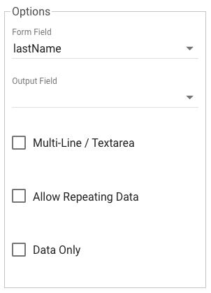
Form Field: Represents the API Key of the component. When a component is dragged to the design surface, this value will be set automatically. The selected component can be changed if necessary. One may need to change the selected component if form logic is updated after the mapping is built.
-
Output Field: Select a GlobalCapture field to assign the component data to. An output field is not required if the data for the form element is not used in the workflow, and is not being released as index data.
-
Multi-Line/Text Area: Set this option if the component when rendered to the PDF output should be formatted as multi-line, wrapping text.
-
Allow Repeating Data: Set this option when the form component is part of a data grid, and you want repeating lines to display.
-
Data Only: Only useful when an Output Field is selected, use this option to indicate data should not be written / displayed on the document. This option is often used when form data is used to trigger workflow logic, but that data is not relevant to the document itself and should not be displayed.
Formatting
-
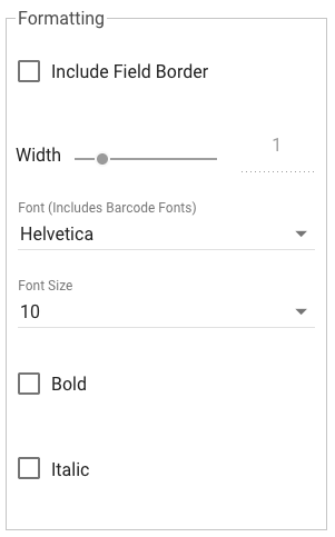
Include Field Border: When the component data is written to the output document, a border is displayed. Adjust the with slider to control the border's width. Borders can be used to create a rudimentary table cell structure for repeating elements.
-
Font: Used to select the font to be used when the document is generated. If you wish to display component data as a barcode, it is selected here as well.
-
Font Size: Size, in points, to render the components text.
-
Bold/Italic: When the document is generated, component text will display these characteristics.
Position
-
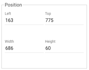
Left, Top: Represents the X and Y coordinates of where the components text will begin positioning. Values will adjust automatically as the component is moved with drag and drop, or nudging. Changing the value manually with reposition the component.
-
Width, Height: Represents the width and height of the component text area in pixels. It's recommended to have components that are aligned to have shared heights and widths for the best look.
Multiple Field Selection
Designers can select multiple components that have been added to the designer. When doing so, settings for the selected components can be set in a single step.
Toolbar options (nudging), and well as individual component options in the component settings panel can be adjusted for multiple components at one time. Select multiple components by holding down the shift key and clicking each component. Available Options and Formatting settings will vary depending on the types of components selected.
You can only select components that exist on the same page.
When multiple components are selected, alignment and dimension settings are available to adjust size and position relative to one of the selected fields. Use these tools when mapping forms to make quick work of aligning components after they have been placed on the design surface.
For example, drag and drop one component into the correct location for a line of fields, then select all the components for a line and choose Alignment > Top, selecting the field that was manually positioned. All additional fields will snap into perfect alignment.
Alignment
-
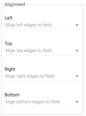
Left/Right: Alligns the selected fields to the left or right edge fo the field selected from the dropdown. Only the x (horizontal) position is impacted.
-
Top/Bottom: Alligns the selected fields to the top or bottom edge fo the field selected from the dropdown. Only the y (vertical) position is impacted.
This has no impact on the size of the field.
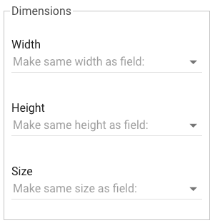
Dimensions
-
Width/Height/Size: Changes the size of the field to match the dimension of the field selected from the dropdown list.
All changes are anchored from the top left corner. The x,y position of the top, left corner does not change.