
Set a custom background color on Button, Panel and Well components directly in the form builder, without custom CSS.
This feature requires GlobalForms version 10.7.1 or greater.
Set a background color
-
Open the component's settings and go to the Display tab.
-
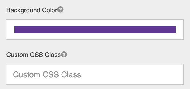
Use the Background Color picker, just above Custom CSS Class, to choose a color.
-
Save the component. Panels and wells show the new color in the builder right away.
Background color and Theme
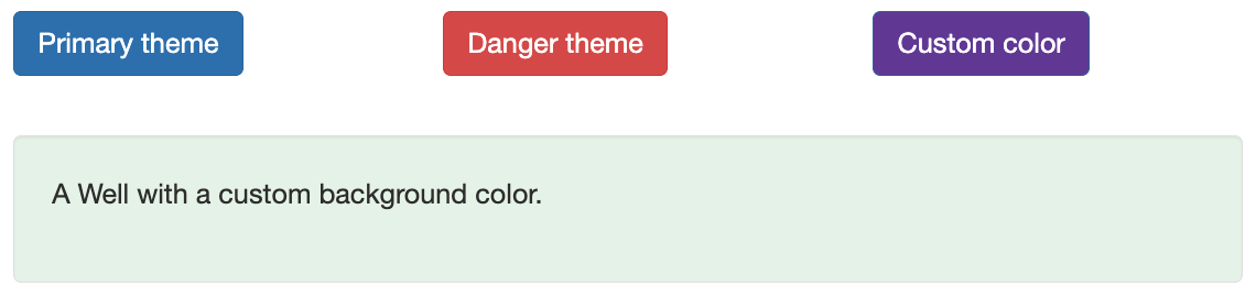
Buttons and panels also have a Theme setting with preset colors. The most recent choice wins:
-
Choosing a Background Color overrides the theme's color.
-
Choosing a Theme, even the one already selected, clears the custom background color and uses the theme again.
Default button color
New Button components start with the background color #008cba. Change it with the picker or choose a Theme.
Buttons that have no background color saved, for example in forms imported from older versions or created outside the form builder, also show #008cba, whatever their Theme says. Open the button's settings and choose its Theme again to use the theme's color.
Keep button text readable
Button text stays white whatever background you choose; it doesn't switch to dark text on light colors. Choose a medium or dark background color for buttons. If you need a light button, add dark text with custom CSS. See Using Custom CSS.
Tips
-
For styling across many forms, use custom CSS instead.