What's New
GlobalForms 10.3 is a release focused on ease of use. Many of the common tasks and use cases in forms deployments have been evaluated and made easier with simple point and click options, versus having to engage in scripting.
Task Lists
Bring form based task management to the next level using a new Task List Dashboard. Available to all customers who upgrade to version 10.3, Task Lists allow form builders to create filtered lists of form that have been submitted for better user engagement.
Instructions for usage of task lists and their management can be found here.
Localization Support
GlobalForms has always supported localization in various forms. Beginning in version 10.3, cross form localization is now available, allowing for common component translations to be made once and shared across all forms in an environment. This version also makes both building and usage of localized forms much easier.
Instructions for usage of localization components can be found here.
Supporting external CSS and JS
Referencing external JS or CSS files is generally reserved for advanced users. Most commonly used by customers seeking to adopt a specific look / style in their forms, or by application builders looking to reference external libraries for specific functionality. GlobalForms has always been capable of referencing external JS and CSS, but doing so required a number of steps, and the process is greatly simplified.
Now external references can be applied at the Form level. When creating a new Form, sections for Scripts and Links appear below the Form’s name and path. These options may be left blank for users that do not need them.
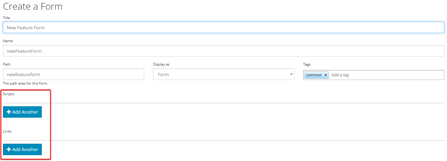
Use the Add Another button in either section to specify the paths. Note that these references will load in the browser when a user accesses the form. The End User’s browser will need to be able to reference the URLs specified here. Customers may host their files in the web accessible location of their choosing, or GlobalForms itself can host them. For “self hosting” scenarios in GlobalForms, place the files in the GlobalForms “client/dist/view” folder.
Image Component
The new Image Component allows users an easy drag and drop answer to referencing images in your forms.
Drag and drop the Image Component onto a form and you will be presented with the following configuration:
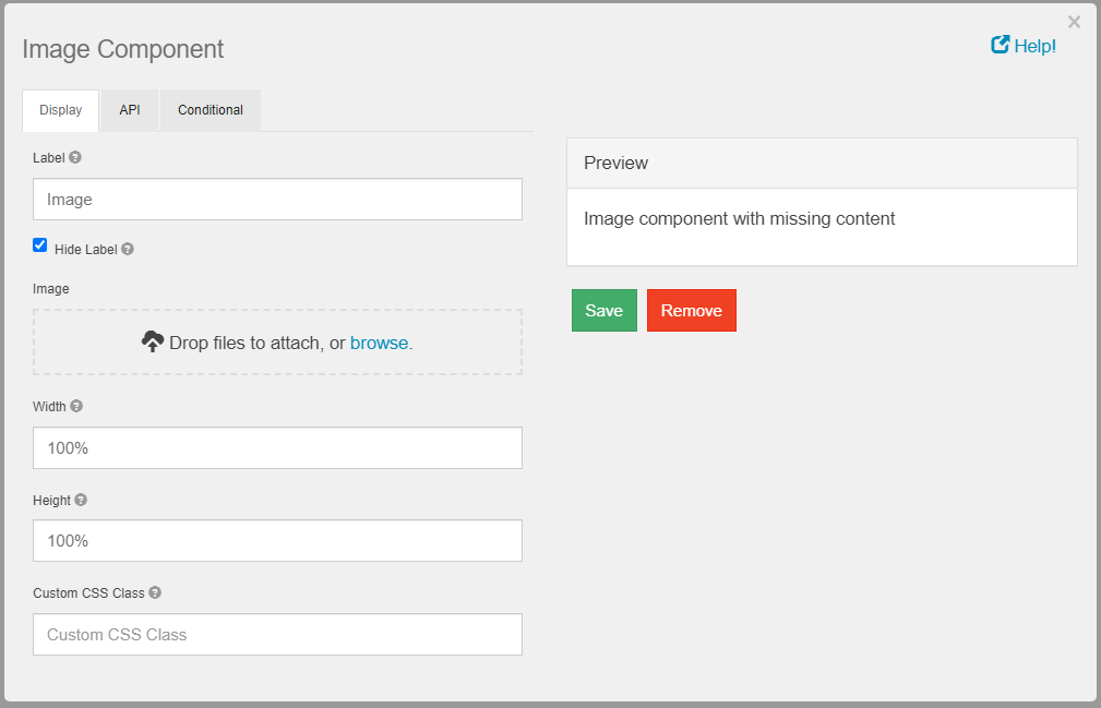
In the Image section, specify an image file to include. We recommend using PNG for both size and scalability. If necessary the height and width parameters can be leveraged. Image components will also size to their container, so size may be controlled by using a columns component.
We strongly advise you adjust images to the smallest size possible in (bytes, kilobytes). Know that if you attach large images, the content needs to be loaded by the browser which can degrade the user experience, especially over slow connections.
Default Values
Many default values can be set with a single line of JavaScript. While this remains possible, GlobalForms 10.3 now offers a no code solution to common default values.
Options available may depend on the component being used, but Current User, Current Node, and Current Date are now all available options.
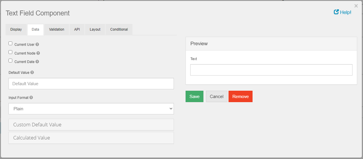
If you wish to use one of the default values, simply check the box for the data you wish to collect on the Component’s Data tab.
Conditional Properties
Prior to GlobalForms 10.3, visibility was the only available option for conditional display. Options are now available for Disabled, Required, and Hidden Input (password style fields with masked input).
Of course, the ability to script these form states remains available, so existing forms will continue to function normally. Customers looking to implement this functionality in a no code way can now take full advantage of what is normally more complex scripting in the form.
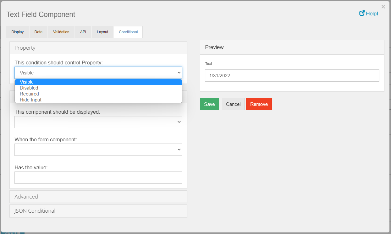
Note that a single component may have multiple conditional properties assigned to it. This means that a component might be marked as required based on one condition of the form, and it might be marked as not visible based on some other condition of the form. Remember when inspecting and/or troubleshooting forms that multiple conditional properties might be in place on a component.
Role Management
Available in 10.3, Role Management offers the ability to create roles or “groups” for sets of users, making permissions management for more complex applications significantly easier.
Roles may be used to secure entire forms, applications, or parts of a process. To support role management, two new forms have been added to the GlobalForms designer:
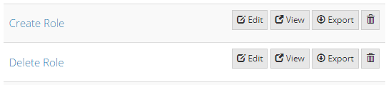
As the names imply, the form are used to manage creation of new roles, or deletion of existing roles.
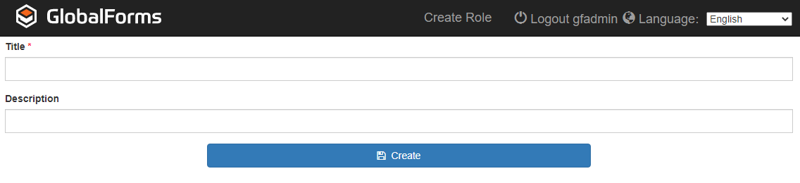
An example of the Create Role form
We strongly encourage the use of meaningful descriptions when creating roles to make future maintenance easier. There is no limit on the number of roles that can be created
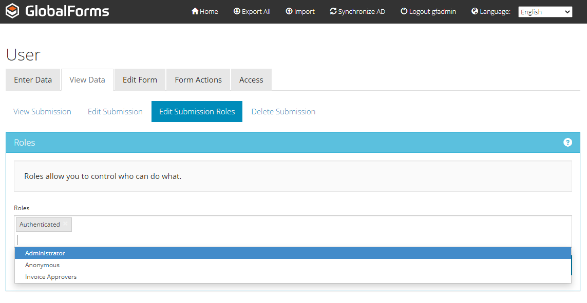
Assigning users to a Role is performed in the User form. Click the View Data tab of User form and select the user submission of interest. Click the Edit Submission Roles link, and you will be presented with the option to configure roles for the user.
View Button
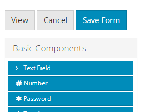
A View button has been added to the form designer. This convenience feature allows you to open a new browser tab with the form’s “user view”.
Above the component toolbox, click the View option to open the form in View mode on a new tab.
Basic Addition / Multiplication
Form designers with out much JavaScript experience may struggle with performing basic addition and multiplication functions across components. This feature removes the guesswork for implementing basic math functions, making it a code free experience if desired.
Only numeric components can be leveraged when using this feature. If there is a need, customers may leverage text or other non-numeric component options, but in such cases you will need to write the functions and associated type casting (where necessary) on your own.
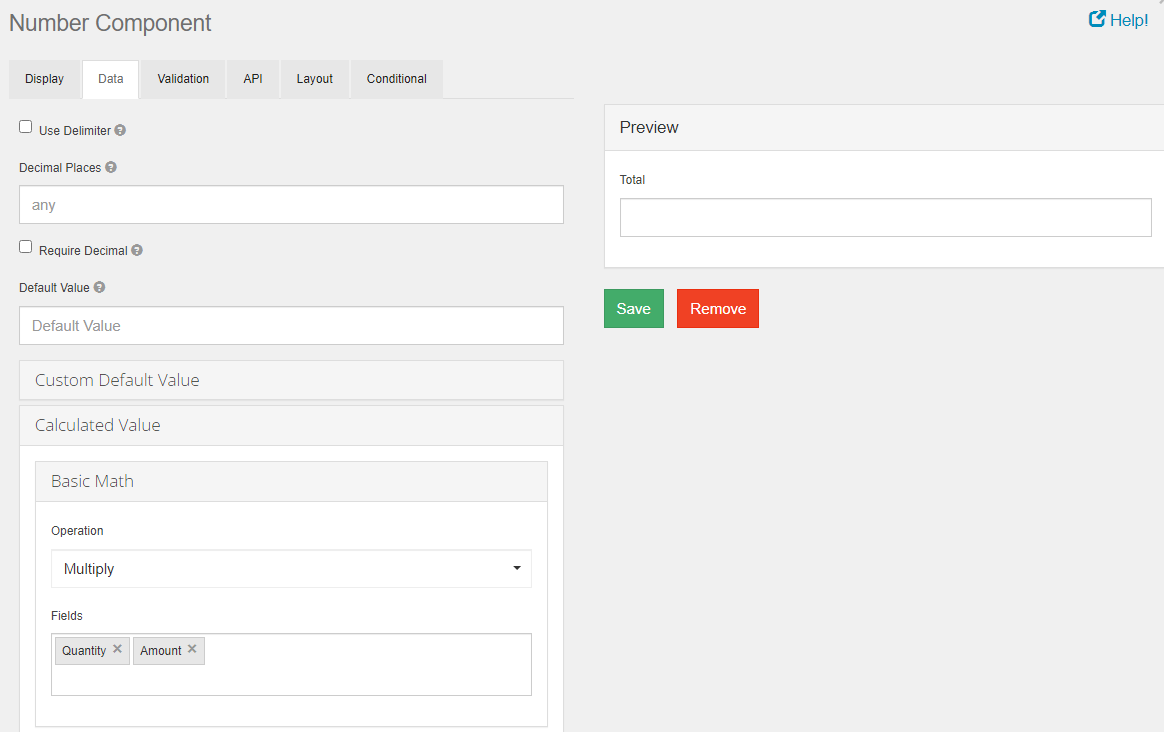
In the Calculated Value section of the Data tab on a numeric component, there is now a Basic Math option. In the Operation drop down, choose the math operation of interest. In the Fields text area, choose the components of the form you wish to perform the operation against. The component you are currently editing will receive the output value of this operation automatically.