Select
The select component offers traditional drop-down style list functionality to any form. Use the component to display simple lists of data like general ledger accounts, US States, or sales territories.
In its most basic form, list data is managed on the data tab in the Component's settings:
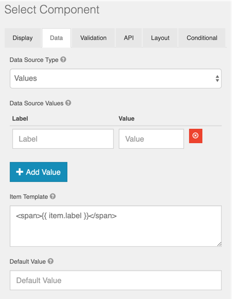
Provide a Label and a Value to represent each item in the list. Note that the Label is what displays to the user in the list. The Value is what is available in rules, as well as what is mapped as the selected value when the form is processed by GlobalCapture.
A note on size
Lists with thousands or tens of thousands of items should be avoided. The objective should be to whittle that data set down to a manageable size. That number should never exceed 1000, but ideally should be less than 500 (and maybe even less depending on the user's browser and computer). It is ineffective to expect a user to open a select list and scroll through 500+ items to find what they are looking for. Standard windows select components have memory limits, and browser based select components will incur performance delays while the browser attempts to load items. This delay be variable depending on both the browser and the resources available on the computer.
While Select components can be very simple, they also can be bound to external sources, greatly extending the flexibility of the component and its use in general forms design. Click here to learn more about binding lists to external sources.
Selects can be further extended in a variety of use cases. For example, you may want lists to control the display of data in other lists. Click here for an advanced example of conditional lists in a Data Grid component. Conditional list selections can be leveraged to control the amount of data presented in any Select component.