Expand / Collapse A Panel
Panels may be used to group information on a form. Depending the form and use case, it may be desirable to "collapse" a panel, allowing the user of the form to minimize the number of fields and/or data viewable. For example, a form with many logical sections might use panels to contain the form elements for each section, and the user can expand and collapse sections as they move through the form.
This demo form illustrates panels that work this way. The caret character in the top right corner of each panel can be used to expand and collapse it.
Collapsible
Note that some versions of GlobalForms do have a "Collapsable" option in the component's properties, but this option is not intended for the purposes outlined here and this component option should be ignored.
Implementation
Setting up collapsing panels on a form does involve a small amount of Javascript and CSS. Once your GlobalForms system is setup to support it, adding collapsing panels is very straightforward.
- Create a new CSS file on your server called PanelStyles.css.
Add the following CSS to the file, and save it to the GlobalForms\client\dist\view folder on the server.
PanelStyles.css
CSS.clickable{ cursor: pointer; } .panel-heading span { margin-top: -20px; font-size: 15px; }Create a new Javascript file on your server, called panleLogic.js.
Add the following Javascript to the file, and save it to the GlobalForms\client\dist\view folder on the server.
panelLogic.js
JSjQuery(document).ready(function(){ jQuery(".panel-body-open .panel-heading").append("<span class='pull-right clickable'><i class='glyphicon glyphicon-chevron-up'></i></span>"); jQuery(".panel-body-closed .panel-heading").append("<span class='pull-right clickable panel-collapsed'><i class='glyphicon glyphicon-chevron-down'></i></span>"); jQuery(".panel-body-closed .panel-body").addClass('collapse'); //Collapse specific panels by default. }); jQuery(document).on('click', '.panel-heading span.clickable', function(e){ var $panel = jQuery(this); if(!$panel.hasClass('panel-collapsed')) { $panel.parents('.panel').find('.panel-body').slideUp(); $panel.addClass('panel-collapsed'); $panel.find('i').removeClass('glyphicon-chevron-up').addClass('glyphicon-chevron-down'); } else { $panel.parents('.panel').find('.panel-body').slideDown(); $panel.removeClass('panel-collapsed'); $panel.find('i').removeClass('glyphicon-chevron-down').addClass('glyphicon-chevron-up'); } });
Enabling The Form
With the Javascript and CSS saved to the server, collapsing functionality can be added to any GlobalForms simply by adding references to the files.
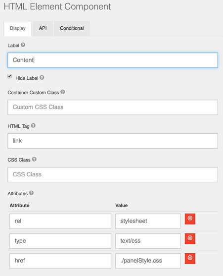
- Add a new HTML Component to the top of the form and reference the CSS file. The properties should look like this:
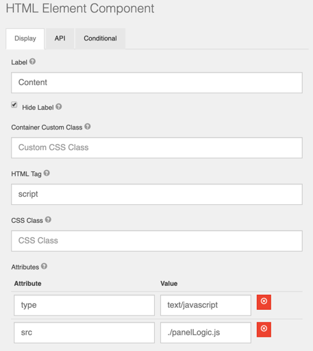
- Add a new HTML Component to the top of the form and reference the JS file. The properties should look like this:
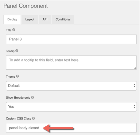
- Add a panel to the form. Any panel that should have Collapse / Expand ability needs a value added to the Custom CSS Class property of the component. Possible values are panel-body-closed or panel-body-open. Use the appropriate class to identify the panels default state of open or closed.