Setting Components To Disabled and Required
Customers using GlobalForms 10.3 or greater can leverage built in functionality to create disabled and/or required components without any Javascript. For advanced users requiring more discrete control, the foundational principles outlined below remain. For customers looking for an easier way to implement basic conditionally required components, see the What’s New documentation here.
Most form components have design time options to set various control properties like Required and Disabled. In some cases, it might be desirable to set those properties conditionally based on other parameters of the form. The the form attached to this page demonstrates a checkbox component controlling the state of a Text Area. Click here to download the sample for use in your own GlobalForms environment.
In this example:
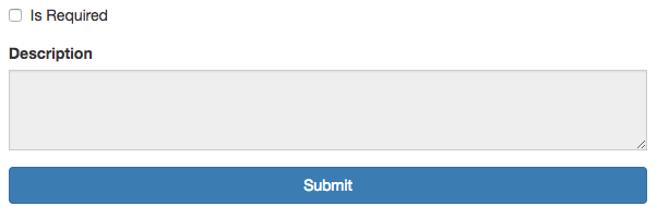
When Is Required is not checked, Description is disabled and does not contain the required property.
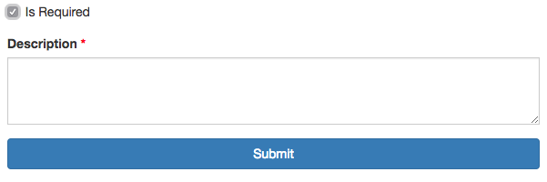
When Is Required is checked, Description is enabled and marked required.
When a user unchecks Is Required, the Description text area goes back to its original state and is clear of any text previously entered.
The logic to support this behavior is performed in a conditional rule on the text area component.
Conditional Rule
if (data.isRequired)
{
    component.validate.required = true;
    component.disabled = false;
}
else
{
    component.validate.required = false;
    component.disabled = true;
    data.description = '';
}

show = true;