Columns
The GlobalForms designer uses a 12 cell grid system, allowing for easy layout of components on a form. When you create a new form, the default design surface is made up of a single row and a single column that spans all 12 cells of the grid. If you drag a component onto the designer, it will by default fill the column it's dropped into. This allows you to create responsive forms that scale to the users environment regardless of screen size or resolution. The Columns components allows you to break up that default row into additional rows and columns, up to 12 cells wide. With a columns component on your from, you will be able to drop other components (including other Columns components) into the column and that component will be bound to the width of its parent.
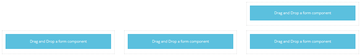
When you drop the component into your form, it will by default load with 2 columns that are 6 cells wide in the grid.

Additional columns, up to 12, may be added in the settings of the component. Use the Add Column button to add more columns, and adjust the width of each to control how many cells each element spans. Always remember that the sum of all Widths in a single Columns component should never exceed 12.
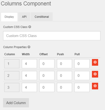
In the example above, there are 3 columns defined that will span 4 cells each.

Use the Offset property on a column to position on the grid. For example, if you want to have a single column right justified, and 3 columns below it, you can place two Column components in the designer. The first would be a single column with a Width of 4 and an Offset of 8. The second would be that same as the example above, 3 columns with a width of 4.
It's helpful to experiment with column positioning on a blank form, adjusting Columns, Widths, and Offsets to see the effects any changes have without impacting a production form.
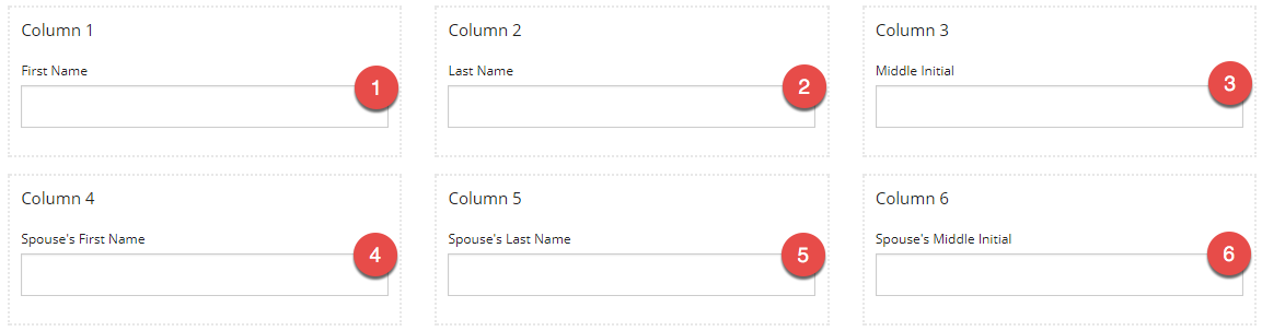
It is important to note that Columns components can have an impact on the default tab order of a form. While most GlobalForms components support the ability to override the tab order, it's easier to build forms in a way that supports the tab order you expect without having to individually modify each component. The tab order when using columns is for Tab to move the user through all components in a column before going to the next column. In the example below, the expected tab order would be to move from left to right on the first row of fields for the individual, then through the second row of fields for spouse. Given the layout below however, the tab order follows the illustration.
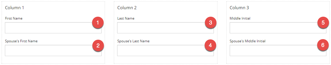
To better control the tab order in this situation, use two different column controls, placing the first row of fields in the first set of columns, and the second row of fields in the second column.