Checkbox
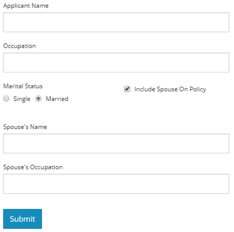
The Checkbox Component allows you to add a basic Checkbox to any form. Use checkboxes to allow users to add yes/no input logic on a form. Checkboxes may also be used to control the visual display of a form based on user input. In the example below, conditional logic is used to show additional inputs based on a Checkbox being selected.
Checkboxes have common properties available to most form components:
- Label - Modify the label to control the text displayed next to the Checkbox.
- Label Position - Use label position to control the Label's placement in relation to the Checkbox: Top, Left, Right, Bottom.
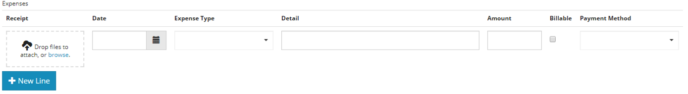
- Datagrid Label - Use this option to control whether or not you want Label text to appear when the checkbox is embedded in a Datagrid. In a Datagrid component, the column itself will have a header. It might be more aesthetically pleasing to not replicated the Label text in the Datagrid itself. The expense entry example below illustrates a Checkbox with no Datagrid Label.
Using Checkboxes In Rules
If your Checkbox will be used in rules on other components, it's a good idea to set a default value for the Component. In the Settings panel, click the Data tab. Set a value of false if you want the default to be no check, or set true if you want the Checkbox to be checked by default.
Mapping a CheckBox
For a checkbox to display as a check in the form mapping designer, you will need to select the checkbox in the middle of the mapper so it turns yellow. Then drag your field onto the mapping canvas.