Button
The Button is a part of almost every form. Sometimes you may even leverage multiple buttons on a form depending on various conditions or form states. Buttons have an action associated with them, and the default action is Submit. As the name suggests, Buttons with the Submit action submit the form to the GlobalForms database.
Buttons have a variety of properties available to them, all accessible from the setting panel:
- Label - Use a Button's Label to control the text displayed on the Button itself. While the acutal text displayed carries not technical relevance, it's often a good idea to make labels contextual for your users. For example, on an expense for, it might be a good idea to change a Button's Label from Submit to Submit Expenses.
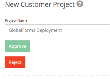
Because multiple buttons can exist on a Form, it can make for a smoother user experience to dynamically show and hide Buttons with different Labels depending on the form state. For example, you might want the Submit Expenses button to hide, and show an Approve Expenses button when a form goes from the submitter to an approver in an expense approval process. - Action - Relevant Actions include Submit, Reset, and Custom.
Use the Submit action to enable a user to submit a form. Without an available submit button on a Form, user input can never be captured by the system.
Use the Reset action to clear all form input restore any default values if applicable.
Use the Custom action to write a JavaScript rule to perform any custom form logic on a button click. - Button Custom Logic - You can provide JavaScript rules for buttons with the Action Type of Submit or Custom. When the button is clicked, the rule will execute. There is an unlimited number of uses for calling a JavaScript rule from a button.
- For a Submit Button, you can dynamically assign the Form's redirect link on successful submission. Refer to the documentation on After Submission Behaviors for specific examples.
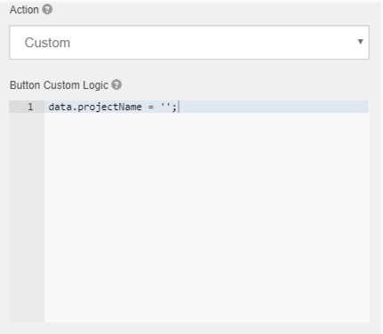
- For a Button with a Custom Action type, you can create your own version of a reset button that only clears or resets specific form elements. For a field with the Property Name projectName, use the following JavaScript:
- For a Submit Button, you can dynamically assign the Form's redirect link on successful submission. Refer to the documentation on After Submission Behaviors for specific examples.
- Theme - Buttons can easily be styled using some default color options. Set the Theme of the button to an option that best suits your needs. If you want to display button options that perform different actions, if can make sense to style them differently.
- Size - Use the Size options available to control the size of your buttons. In general, the default option of Medium is a good choice for most applications.
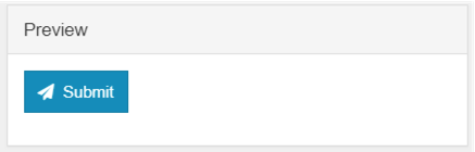
- Left Icon / Right Icon - Buttons can include icons before or after the Label text. Refer to http://fontawesome.io/icons/ for the names of icons you can include on buttons. As an example, if you wanted to include a plane icon on a submit button, in the Left Icon box, type fa fa-paper-plane to get the follow result:
- Disable on Form Invalid - Use this checkbox to control whether or not the button can be clicked if the Form does not pass validation (meaning there are form fields in an invalid state, like a required field being left blank). This is particularly useful for Submit buttons, where you want to make sure the form is complete before being submitted.