Understanding Components
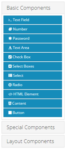
Components are the building blocks of Forms and Resources. A comprehensive set of tools are available for styling forms and providing input control to suit any aesthetic taste and functional need. When editing a form, the component toolbox can be found on the left hand side of the designer. While anyone can build a basic form in GlobalForms, it's helpful to understand the full set of Components available to be sure the right component is used for a particular task.
When a Component is placed on a form, a control menu is displayed when the mouse cursor hovers on it.
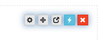
From left to right:
The gear icon is use to access the settings of the component.
Click and hold on the 4-way arrow icon to select the component and drag it to a new area of the form.
The duplicate icon is third from the left. Click this icon to make a copy of the component.
Spring 2026 - The blue lightning bolt indicates this component contains user defined script rules.
The red X icon is used to delete a component. Be especially careful deleting layout components where there might be a large set of components nested within it. While removing a layout component will warn you that all nested components will also be deleted, it's always advisable to use caution here.
Components are broken down into three sections to help simplify the user experience. When working with heavily nested form components, be sure you are clicking on the correct icon.